
Large loans across the United States
Cash for COVID VisualizationOver 150k, U.S.A.
The vast majority of the P.P.P money went to a relatively small percentage of borrowers. Each dot on the map represents one of these loans and the pop up tooltip provides the name, location and amount borrowed for each business.
All project code and notes
Fork or clone from the GitHub repository.
Load times and viewing recommendations.
All interactive maps and visualizations were done using quite a bit of data and are hosted on Tableau public so load times are dependent on the strength of an individual’s internet connection and hardware capabilities. Please be patient and as a word of caution, selecting “All” on any graphics may be time consuming because the server will be attempting to access potentially millions of data points. Additionally, small screen devices may not display as well as larger ones. Use the options at the bottom of the viewport to access fullscreen or save as a file for offline use.
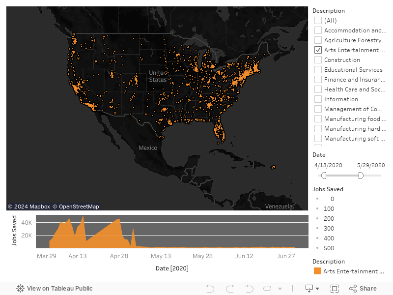
Visualization of PPP loan recipients in United States
Sheri Rosalia | Data Engineer
Data Engineer | Data Analyst | Data Scientist