Statistical Analysis of Yelp restaurant ratings
Want to chow down in L.A.?20,000 restaurants analyzed
What does rating and review data reveal about the Los Angeles, California food scene? Let’s take a look at data on almost 20,000 eateries which was retrieved courtesy of the Yelp Developer API.
For those of you not familiar with it, Yelp (yelp.com) is a popular review site that uses a 1-5 rating scale; 5 being the best.
The images below are screenshots from statistical and mapping analysis using Python programming.
All project code and notes
Fork or clone from the GitHub repository.
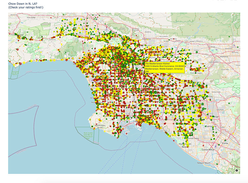
Restaurants Mapped
Clicking on this map links to a larger, interactive display featuring mouse controlled zoom, rotate and tilt features. It shows the average rating for each restaurant on the map. The ratings system is based on a scale of 1-5; 5 being the “best”. Red represents ratings under 2.5, yellow below 4 and green is for top notch ratings which are either 4.5 or 5.
Ratings Gap
This histogram is reflects the total count of ratings and in so doing reveals a void. Note the dip of frequency in the 2.5 star category. For whatever reason reviewers were inclined to rate restaurants above 3 or below 2.
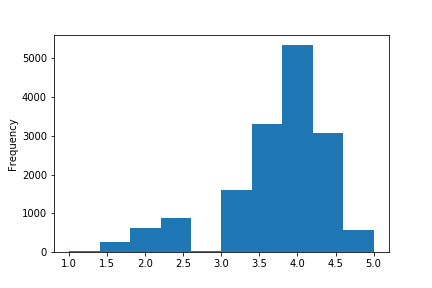
Skew towards 4
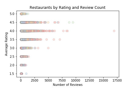
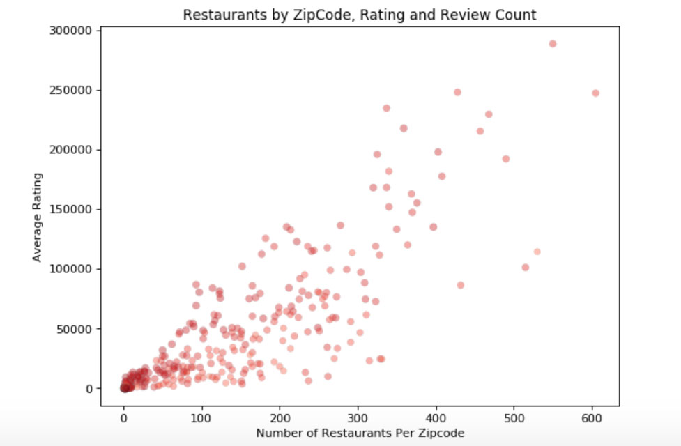
It seems like establishments that stay in business long enough are likely to wind up with a rating of about 4. The next series of visualizations show the correlation between review counts and ratings.
Breaking the mold
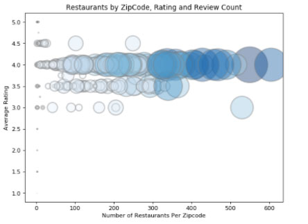
The outliers reveal a virtual tidal pull towards a mean rating of roughly 3.8 – 4.1 over time. However, there are a few establishements that have managed to defy the odds and either stay in business despite horrible reviews, or maintain top notch ratings along with high review counts.
Bold and bad
Zipcode 90045 stands out as a hotbed of rotten ratings. It is visually represented as a light blue circle towards the higher end of the review counts but on the lower end of ratings blue bubble chart above.
The worst of the worst
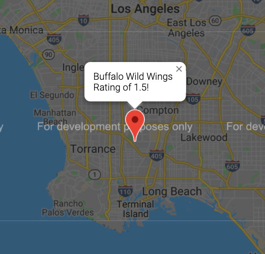
This zipcode is also home to what might be the worst restaurant in all of Los Angeles with a whoppingly poor average rating of 1.5, yet while continuing to stay in business as reflected by relatively high number of reviews.
Zipcode 90045 stands out as a hotbed of rotten ratings. It is visually represented as a light blue circle towards the higher end of the review counts but on the lower end of ratings blue bubble chart above.
Captured audience?
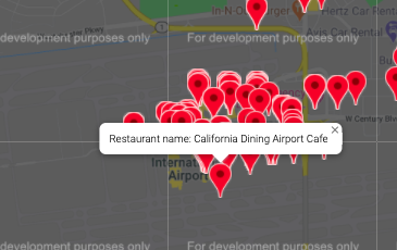
Digging a little deeper into the 90045 revealed that this area is also home to the Los Angeles International Airport and numerous hotels. Perhaps the sheer volume of people with little other option than to grab a bite close to accomodations or flight times enables these businesses to stay open despite poor ratings.
Zipcode 90045 stands out as a hotbed of rotten ratings. It is visually represented as a light blue circle towards the higher end of the review counts but on the lower end of ratings blue bubble chart above.
Heads above the rest
On the positive end of the outlier spectrum are a few places that seem worthy of making a special trip to check out.
Most reviewed
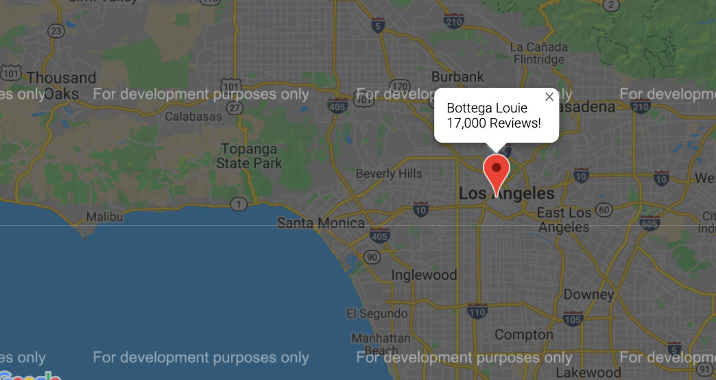
Note that in the light pink and brown scatter plot there is an outlier category 4 column that has over 17,000 reviews. This is nearly triple the median of review counts and the turns out to be: “Botega Louie” a patisserie & café in downtown.
The best
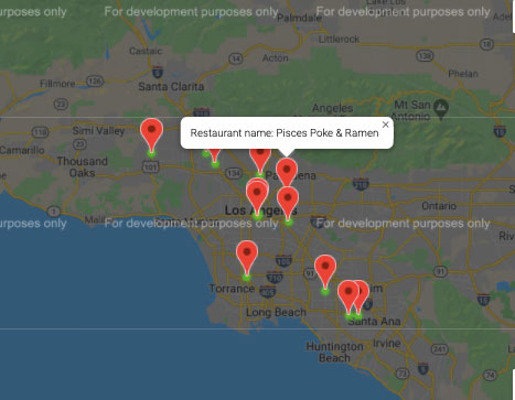
Out of 20,000 locations, a few manage to hold on to top ratings even as review counts climb and the locations seem to be spread throughout the city and reflect a variety of cuisines.
Trending
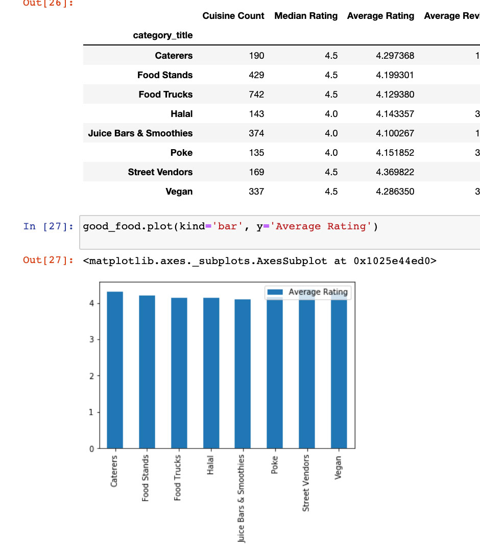
Looks like the food categories that are rated highest are types that might not even have been readily available in the not too distant past such as Poke, Vegan and Halal.
The image below is a screenshot of a table and graph reflecting top rated cuisines.
Most loved
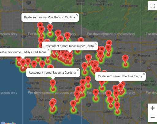
Seems like LA loves Mexican food more than anything else and the data reveals the number one most popular food item: Tacos.
Diverse
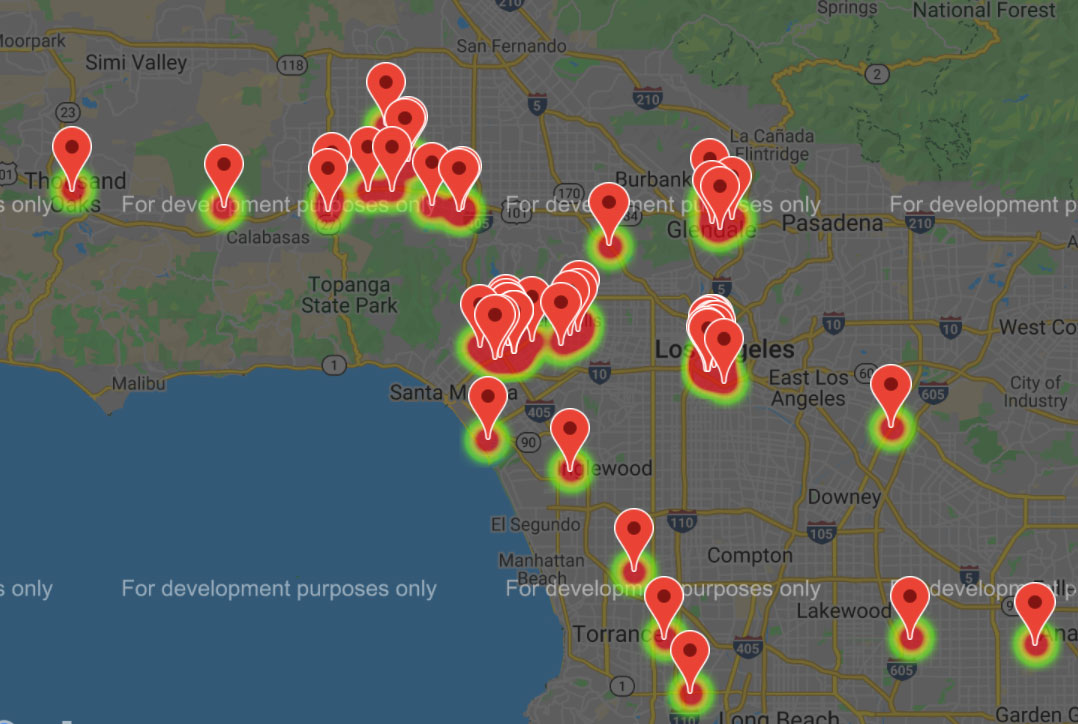
The diversity of Los Angeles is reflected in the proximity and variety of options. For example these are “Persian” restaurants:
The Data
Ratings, reviews and geographical data were accumulated courtesy of the Yelp developer api.
The Python scripts for the api and first map is available for download in this GitHub repository: LA_Restaurants_Yelp_API
Clean up, graphs, google maps and csv files are available in the GitHub repository associated with this webpage. Here is the repository link: Stars of LA
The data and it’s limitations:
Most, but not every location is accounted for in this data set because of the way the Yelp api works. What we have here is a random sampling of almost 20,000 establishment from over 150 zipcodes but there are likely more than 5,000 restaurants missing.
As is often the case, diving into analysis produces more questions than actual conclusions. Ratings are subjective by nature. It is hard to be certain as to the reasons for them and in the age of paid social influencers, their veracity suspect.
Related Projects
Lines of inquiry such how the data could be further analyzed using Machine Learning, statistical analysis, combining with health code violation and demographic information are explored in the following “spinoff” projects.
Sheri Rosalia | Data Engineer
Data Engineer | Data Analyst | Data Scientist

